I have a challenge for myself. To make a branding campaign poster every day. What you will find here is all of those posters as well as some others I created


McDonalds “The Real Golden Arches”
This McDonald’s design flips the iconic golden arches on their head, literally. Instead of the traditional logo, the fries themselves take center stage, forming the unmistakable shape of the arches. Because let’s be real—the fries are the real golden arches. This concept plays with brand recognition in a fun, unexpected way, turning a beloved menu item into the ultimate visual symbol.
Rolex “Golden Hour Glow”
This poster focuses on the feeling you can get while wearing a Rolex while also tying into its beauty in design. I focused on a simple but effective brand poster for this one.


Hersheys: “Too Good to Play By the Rules”
I wanted this poster to be fun at heart. I love hershey’s and do find myself having a hard time just eating one square at a time. I learned a lot from the creation of this poster and got to use my compositing skills first hand.
Chips Ahoy Brand Poster
This poster is designed to immerse the viewer in the playful world of Chips Ahoy!
The composition enhances the crave-worthy appeal, with chocolate chips appearing to break free from the cookie.
The logo placement reinforces brand identity while interacting with the milk flow, creating a sense of unity in the design.

DUNKIN: “Sip, Dunk, Repeat”
This poster focuses on the daily routine of Americans that run on Dunkin, Sip, Dunk, Repeat ties in all the aspects of the Dunkin experience by getting a hot coffee and dipping the iconic donuts.

A24 Poster
This design is more focused on the vibe of the A24 movie picture brand. A24 is known for making moody dark and weird but inspiring and beautiful films. I decided to go for a darker abstract electric vibe.

Delta: “Fly First Class”
This poster I wanted it to play on the underlying struggle of flying economy. Out of a the relatable experiences of not having enough leg room. I wanted to foster a caring environment and showcase the amenities of the first class experience.

Nike Air x Jordan Magazine Cover
This poster is a hypothetical magazine cover for Nike Air and Off White Jordan collaboration. This magazine cover focuses on key colors that the nike and off white brand collab uses.

Poppi Branding Poster
This Poppi poster captures the crisp, refreshing essence of their Lemon Lime soda with a vibrant splash of energy. The composition, bold citrus imagery, and water splash create a sense of movement and freshness, mirroring the brand’s playful yet health-conscious identity.

Apple Watch Ultra “Time Moves. So Do you.”
This poster focuses on the bold precision of the Apple Watch Ultra, designed for adventurers and athletes. The typography, textured gradient, and striking product shot emphasize durability, movement, and innovation. “Time Moves, So Do You” reinforces the watch’s integration into an active lifestyle.
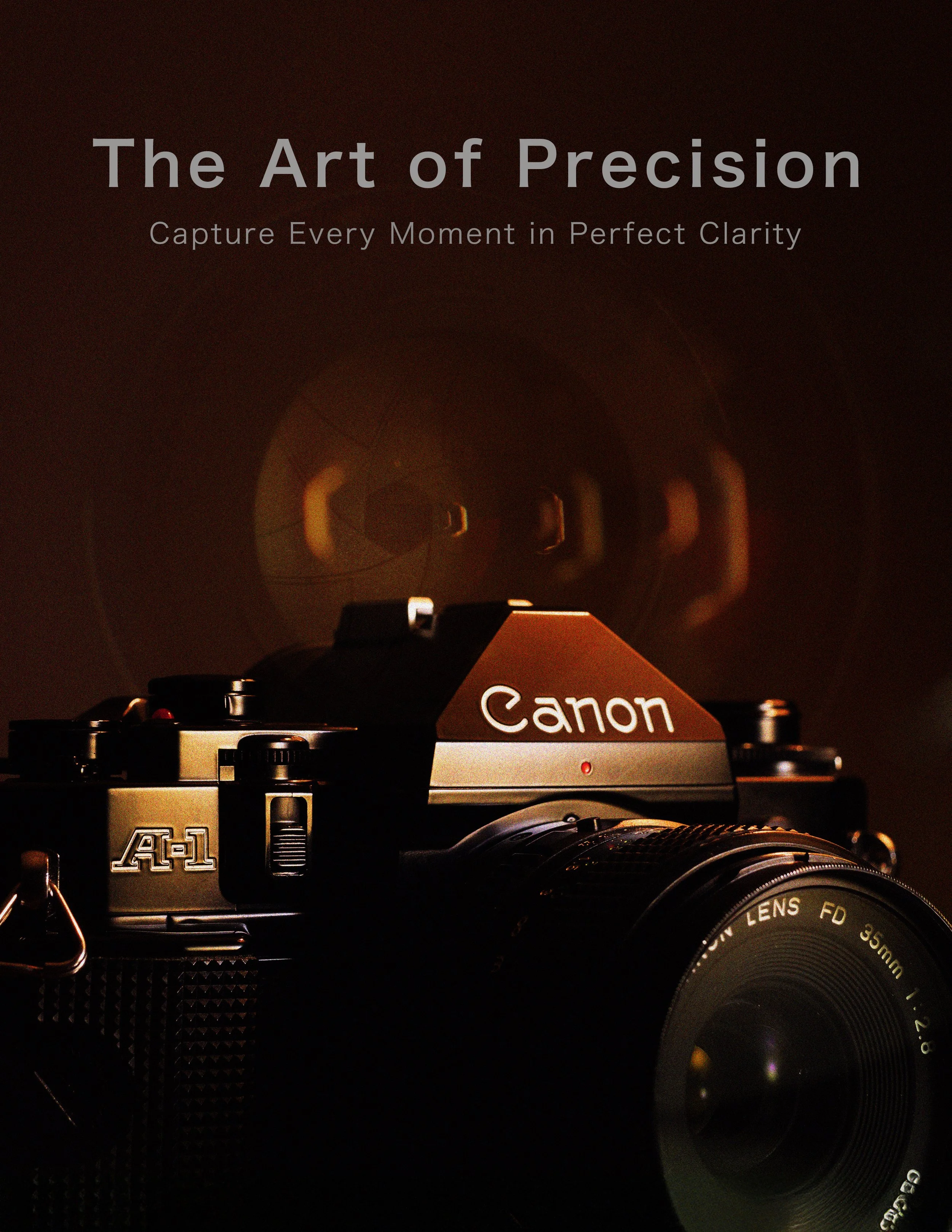
Canon “The Art of Precision'“
This poster focuses on the aesthetic of film. Utilizing an old Canon A-1 film camera and a beautiful lens in the background paired with a grain overlay ties in that feeling you get when you see film.

“Press Play on Nostalgia” - A Spotify Retro Brand Poster
This design ties the warmth of analog nostalgia with the modern streaming era. “press play on nostalgia” is a reminder that music is timeless whether its like hiss of a cassette (which I enjoy) or the crisp sound with Spotify, the feeling remains.

PORCHE “Power Unleashed”
This daily brand poster was inspired by the raw power of Porsches engineering. The goal was to capture the idea of speed, control and innovation. Typography plays a crucial role in reinforcing the brands identity which is why i went with a sleek modern sans to compliment the Porsche logo

“Play Knows No Limits”
This project focuses on the fun aspects of LEGO’s branding. I wanted to incorporate two of their figures doing something out of the ordinary showcasing the ways you can set up your legos

Sony WH-100X Hear Beyond Reality
This campaign focuses on euphoria associated with music. I wanted to tie that euphoric feeling with the SONY brand and their headphones.

"Feel the Rush" Red Bull Campaign
This design embodies the raw energy and adrenaline of Red Bull, capturing the feeling of speed and momentum. The central can is surrounded by motion, with a bold red streak cutting through the frame, symbolizing the intense rush that Red Bull delivers. "Feel the Rush" emphasizes the brand’s connection to high performance and pushing limits, inviting viewers to experience the power and excitement Red Bull fuels.
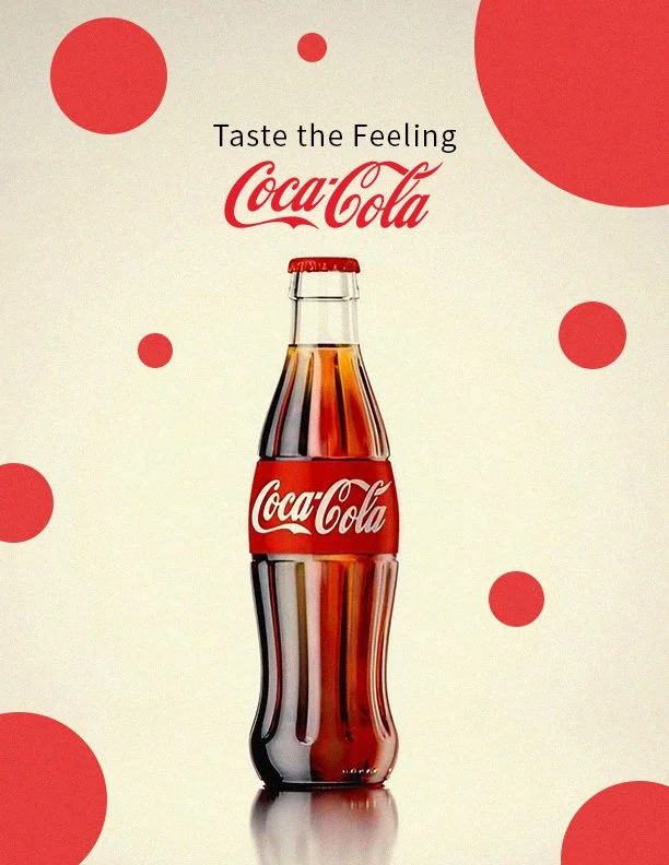

Coca-Cola “Taste the Feeling”
Designed this campaign to focus on the feeling that the drink gives you when you drink it. I wanted to keep the design simple and go with a slightly vintage simple look. Everyone loves the old glass coke bottles which is why I incorperated it into this poster.
PetSmart “All Pets. All Smiles.”
This poster reimagines PetSmart’s brand with a playful, engaging design. The dog interacting with the logo reinforces themes of joy and connection. Floating treats adds a sense of fun, while, "All Pets. All Smiles.", highlights PetSmart’s commitment to happy pets and owners. With clean composition and seamless integration of branding elements, this project showcases my ability to create visually compelling, brand aligned designs.

Nike “Move to Zero” Campaign
This campaign focuses on Nike’s efforts to utilize economically friendlier resources. I decided to go green with this zero emissions poster and focused on the tag like “Zero Carbon. Zero Waste. Infinite Possibilities”


Yellow: Deconstructing Typography Through Color and Form
This poster explores the relationship of typography and visual structure, using the letter 'W' from the word 'Yellow' as the foundation for its composition. By abstracting typographic elements, the design transforms typeface into an fundamental backdrop, reinforcing the relationship between type, color, and spatial depth.
Black Deconstructing Typography Through Color and Form
This poster explores the relationship of typography and visual structure, using the letter 'K' from the word 'Black' as the foundation for its composition. By abstracting typographic elements, the design transforms typeface into an fundamental backdrop, reinforcing the relationship between type, color, and spatial depth.

Red: Deconstructing Typography Through Color and Form
This poster explores the relationship of typography and visual structure, using the letter 'E' from the word 'Red' as the foundation for its composition. By abstracting typographic elements, the design transforms typeface into an fundamental backdrop, reinforcing the relationship between type, color, and spatial depth.

See the Unseen: A Visual Exploration of Science
This poster is designed to ignite curiosity and awareness, putting typography over atomic structures to symbolize the unseen forces that shape our world. It challenges viewers to open their eyes to the beauty and complexity of science.

See: A Reflection of Humanity in Science
This poster explores the connections of nature and human existence, depicting a head formed by multiple human figures. The bold 'See' invites viewers to look deeper into what define us, both physically and conceptually. Science is not just discovery; it is perception